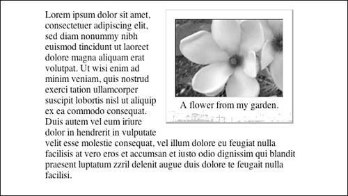
Creating a Photo Frame VariationAnother variation is to create a simple photo frame using the container and some borders. The first step is to change the padding to 15px for top, right, and left edges, and 20px for the bottom. Like the original example, this additional space will be used for the background image. The borders will be used to create a three-dimensional illusion. The top and left edges will have light-colored thin borders, whereas the right and bottom edges will have darker and thicker borders. This can be achieved using three border declarations as shown in Listing 11.8. Listing 11.8. CSS Code for the Photo Frame Variationdiv.imagecaption
{
float: right;
width: 182px;
margin: 0 1em 1em 1em;
padding: 15px 15px 20px 15px;
display: inline;
text-align: center;
border-color: #CCC #999 #999 #CCC;
border-width: 1px 2px 2px 1px;
border-style: solid;
background: url(chapter11c.gif) repeat-x 0 100%;
}
div.imagecaption img
{
border-color: #000 #ccc #ccc #000;
border-width: 1px 1px 1px 1px;
border-style: solid;
}
}
A new background image can be used with the same settings as the original version. Finally, borders need to be added to the image. These borders will be set in the opposite colors to the container, with darker borders on the top and left edges of the image, and lighter borders on the right and bottom edges. The final results can be seen in Figure 11.7. Figure 11.7. Screenshot of the photo frame variation.
|