Creating a Top-Only Flexible VariationTo create a top-only flexible variation of the round-cornered box, two background images are needed. The first image can be applied to the <div> container using background: #fff url(lesson17g.jpg) no-repeat;. This will place the image in the top-left corner of the box. The image used is shown in Figure 17.13. Figure 17.13. Background image used to style the <div> element. The image should be made over 2,000 pixels long so that it will grow to the width of the widest monitors.
The <p> element must be padded on both sides to keep it away from the edges of its container. This can be achieved using padding: 0 20px. The <h2> element must have the margins set to 0 so that there are no gaps at the top of the container. It must also be padded on the top right and left using padding: 20px 20px 0 20px;. A background image is applied to the <h2> element using background: url(lesson17h.jpg) no-repeat 100% 0;. This will position the image at the right of the element. The image is shown in Figure 17.14. Figure 17.14. Background image used to style the <h2> element.
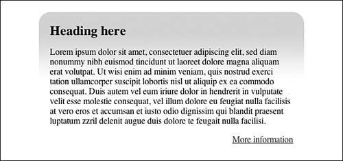
Finally, the .furtherinfo paragraph content needs to be aligned right. This can be achieved using text-align: right as shown in Listing 17.9. The results can be seen in Figure 17.15. Listing 17.9. CSS Code for Styling the Top-Only Variationdiv#pullquote
{
background: #fff url(lesson17g.jpg) no-repeat;
}
div#pullquote p
{
padding: 0 20px;
}
div#pullquote h2
{
margin: 0;
padding: 20px 20px 0 20px;
background: url(lesson17h.jpg) no-repeat 100% 0;
}
div#pullquote p.furtherinfo
{
text-align: right;
}
Figure 17.15. Screenshot of styled top-only variation.
|