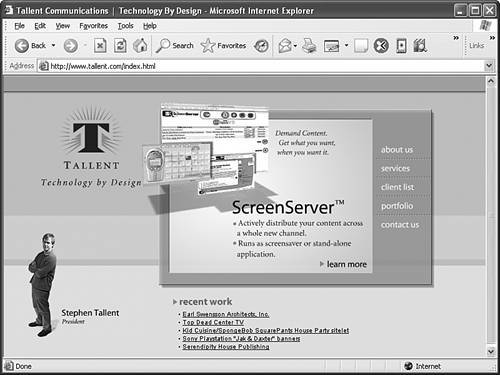
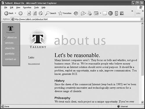
Organizing a Simple SiteAlthough single-page sites have their place, most companies and individuals serve their readers better by dividing their site into short, quick-read pages with graphical navigation icons to move between the pages. That way, the entire site doesn't have to be downloaded by someone seeking specific information. Furthermore, it minimizes having to scroll around a bunch on the page, which can be especially bothersome for people who are using mobile devices to view the site, or who have relatively low-resolution monitors (less than 800x600). The goal of the home page shown in Figure 22.3, like the goal of many web sites today, is simply to make the organization "visible" on the Internet. Many people today immediately turn to the World Wide Web when they want to find out about an organization, or find out whether a particular type of organization exists at all. A simple home page should state enough information that someone can tell whether she wants to find out more. It should then provide both traditional address and telephone contact information and an electronic mail address, either directly on the home page or via a prominent link (like the About Us button in the upper-right corner of the page in Figure 22.3). Figure 22.3. This small-business home page uses distinctive graphics and no-nonsense text to quickly convey the intended mood and purpose. One of the most common mistakes beginning web site developers make is having each page on the site look different than the one before. Another equally serious mistake is using the same, publicly available clip art that thousands of other web authors are also using. Remember that on the Internet, one click can take you around the world. The only way to make your pages memorable and recognizable as a cohesive site is to make all your pages adhere to a unique, unmistakable visual theme. In other words, strive for uniqueness as compared to other web sites, yet uniformity within the site itself. As an example of how uniformity can help make a site more cohesive, take a look at what happens when someone clicks the About Us link in Figure 22.3. The user is taken to the page shown in Figure 22.4, which has a very similar feel to the previous page. The visual reiteration of the link as a title and the repetition of the background, logo, and link graphics all make it immediately obvious that this page is part of the same site as the other page. (Reusing as many graphics from the home page as possible also speeds display because these images are already cached by the web browser on the visitor's computer.) Another helpful little detail on this page is the highlighting of the About Us menu icon near the upper-left of the pagea small pointer is aimed at the About Us selection. (If you would like to view this site online, go to http://www.tallent.com/.) Figure 22.4. Clicking About Us in the screen shown in Figure 22.3 takes you here. The graphical theme makes it instantly clear that this is part of the same site.
|