Font Weight and StyleWhew! That was a lot of detail for a book that's supposed to be straightforward. But to be fair to you and ensure that you've got a solid foundation, I had to do it. Now let's get on with the show! Along with their family and size, fonts can have weight and style. Font weight refers to how bold (or not bold) a font is. Font style refers to different faces that might exist within a given family. Font WeightDefining the weight of the font is done by using the font-weight property combined with an associated value. Values for weight include numeric (100-900, where 100 is very light, 900 is the darkest, and 400 is normal), the keyword normal (corresponding to a weight of 400), the keyword bold (equivalent to a weight of 700), the keyword bolder (specifies the next higher weight), and the keyword lighter (specifies the next lighter weight). Example 9-2 shows a style sheet with a variety of weights applied. Example 9-2. Styles describing font family, size, and weight
body {font-family: Georgia, Times, serif; font-size: 1em; font-weight: normal;}
h1, h2 {font-family: Arial, Helvetica, sans-serif;}
h1 {font-size: 150%; font-weight: bold;}
h2 {font-size: 130%; font-weight: lighter;}
.accent {font-weight: 700;}
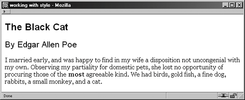
Figure 9-5 shows the text used earlier in the chapter with these styles applied. Figure 9-5. Applying weight to the body, headers, and an accent class. NOTE The use of numeric values 100 to 900 is not well supported. It's a good rule of thumb to use only those number values that correspond directly to a known weightfor example, 400 for normal, 700 for bold. Font StyleFont styles help alter the face. To apply a font style, you use the font-style property with a value of normal, italic, or oblique. The normal value is used only when you're specifically concerned about text being rendered in its normal weight. Otherwise, it's the default and unnecessary to use. Oblique faces are slanted faces that are appropriate for electronic text. The oblique value is truly useful only when a font has an oblique face resident on a user's computer, which doesn't apply to the majority of fonts with which you will be working. If there is no oblique face for the font, the font will appear as italic. The italic value italicizes the font. Bottom line? Your best value for the font-style property will be italic in almost all cases (see Example 9-3). Example 9-3. Styles describing font family, size, weight, and style
body {font-family: Georgia, Times, serif; font-size: 1em; font-weight: normal;}
h1, h2 {font-family: Arial, Helvetica, sans-serif;}
h1 {font-size: 150%; font-weight: bold;}
h2 {font-size: 130%; font-weight: lighter; font-style: italic;}
.accent {font-weight: 700;}
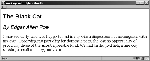
Figure 9-6 shows how the italics are applied to the h2 header. Figure 9-6. Adding a font style to the h2 element. |