A Simple Two-Column LayoutIn the first example, I introduce a very common layout; it contains a narrow left column for navigation and a right column that houses the rest of the page's content. In this example, the navigation column is a fixed width, but the content area is fluidthat is, it changes width depending on the width of the browser window.
First, let's start with the XHTML Strict template, which you can download from www.bbd.com/stylin. The body of the document should be styled to look like this <body> <div id="nav"> <-- a <ul> <li><a href="#">Link 1</a></li> <li><a href="#">Link 2</a></li> <li><a href="#">Link 3</a></li> </ul> </div> <div id="content"> <-- b <h1>A Simple Two Column Layout</h1> <p><strong>Step x - bold text here...</strong> More text here...</p> <p>More text here...</p> <p>More text here...</p> <p>More text here...</p> </div> </body>
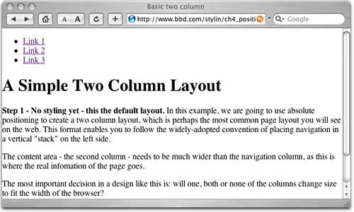
The markup has two divs: the first is the navigation div, which is a set of links organized within a list, and the second is the content div, which is a heading and some paragraphs. It looks like this in the browser (Figure 5.1): Figure 5.1. Here's how the unstyled markup for our two-column layout looks. The first step in creating your two-column layout is to break the navigation out of the flow of the document by positioning it absolutely, like this
body {margin:0px; padding:0px;}
div#nav {position:absolute; width:150px; border-right:2px solid red;}
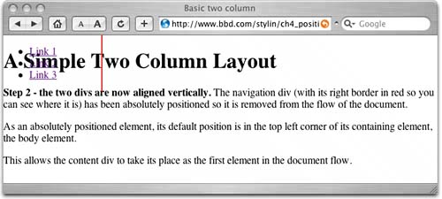
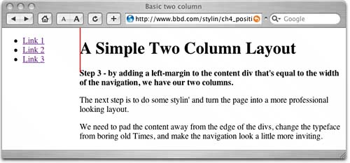
Note that you also need to set the margins and padding of the body to zero to remove any default settings. In addition, you should set the width of your navigation to 150px to create the width of the column and temporarily turn on the right border so that you can see exactly where the div is now positioned. Here's what you get (Figure 5.2): Figure 5.2. The navigation is taken out of the flow of the document, but the content is too far to the left. The navigation is now absolutely positioned, and by setting the left and top to zero, you ensure that its top left corner is aligned with the top left corner of its containing element, body. Now is the winter of our "div content". The content area now takes the navigation div's place as the first element in the regular flow of the document, so it also moves to the top left corner of the parent body element. The page looks a bit of a mess at this point. However, the tops of both elements are now aligned, and all you have to do next is push the content div over to the right (Figure 5.3). We do this by setting its left margin
body {margin:0px; padding:0px;}i
div#nav {position:absolute; width:150px; left:0px; top:0px; border-right:2px solid red;}
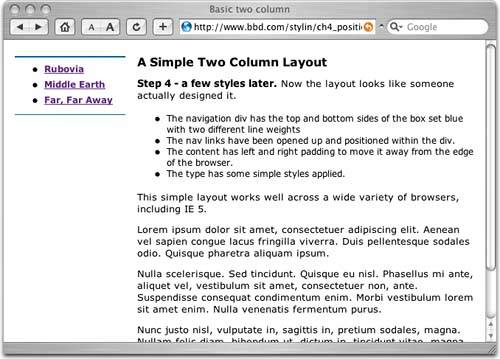
Figure 5.3. There it isa two-column layout with just three lines of CSS. Now it's cleanup time. Now that you have your two-column layout, you need to think about making it look more presentable. You can have some fun playing with this yourself, but here are a few ideas to get to you started (Figure 5.4)
body    {margin:0px; padding:0px;
font: 1em verdana, arial, sans-serif;        <-- a
   }
div#nav {position:absolute;        <-- b
   left:0px; top:0px; width:150px;
   padding:.5em 0 0 0;        <-- c
   margin:22px 0 0 15px;        <-- d
   border-top:2px solid #069;        <-- 4
   border-bottom:1px solid #069;        <-- 4
   }
div#nav ul {margin-top:0px; margin-bottom:.8em;}        <-- e
div#nav li {margin-bottom:.5em;        <-- f
       font-weight:bold; font-size:.75em;        <-- g
   }
div#content {margin:20px 0 0 165px;        <-- h
   padding: 0 1em;        <-- i
   }
div#content h1{font-size:1em;}        <-- 10
div#content p {font-size:.8em;}        <-- 10
div#content li {font-size:.75em;}        <-- 10
Figure 5.4. Here is the finished layout, which has been enhanced with some text and border styles. Here's more detail on what I did to make the layout look better:
|