Three-Column Layout with HeaderMany three-column layouts also have a header across the top of the page, so let's add one. If you start by working from the three-column markup and styles, you can add another div for the header and modify the positioning of your left and right columns to make room for the header at the top of the page. Because both the header and the content are in the flow of the document, once you have the header in place, the content is pushed down and appears correctly below it. Use the markup from the completed three-column layout and add this line after the opening body tag <div id="header"><h1>Three column layout with header</h1></div> Then add these styles to the CSSthe logical place is right after the body styles
div#header {height:60px; background-color:#CCC;}
div#header h1 {margin-top:0px;}
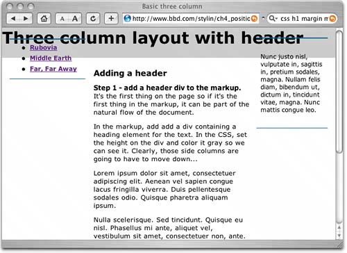
Now your layout looks like Figure 5.9. Figure 5.9. The new header pushes the content div down, but not the absolutely positioned sidebars. If you are wondering why I set the top margin of the h1 element to zero, it's because in some browsers, such as Safari and Firefox, the H1's top margin pushes the header away from the top of the browser, leaving a gap. This doesn't happen in Internet Explorer for Windows.
The content area is pushed down when you add the header, but you have to move those absolutely positioned sidebars by modifying their CSS; they are no longer in the flow of the layout once they are absolutely positioned. So, you need to add the height of the header onto their current top values
div#nav {position:absolute; left:0px; top:60px; width:150px;
   padding:.5em 0 0 0; margin:22px 0 0 15px;
   border-top:2px solid #069; border-bottom:1px solid #069;}
div#rightcolumn {position:absolute; width:125px; top:60px; right:0px;
      margin:20px 15px 0 0; padding:1em  .5em;
      border-top:2px solid #069; border-bottom:1px solid #069;}
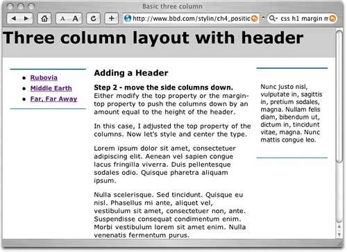
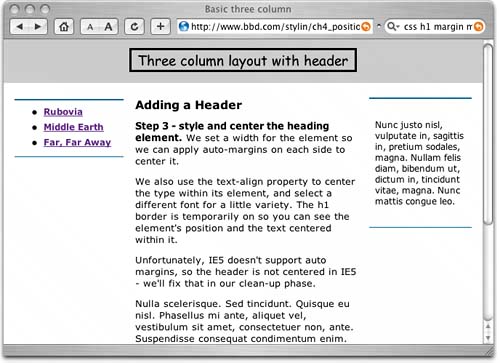
Now things are starting to shape up (Figure 5.10). Figure 5.10. The sidebars are now correctly positioned. Next, we can get to work styling the text in the header. I want to make it a lot smaller (surprised?) and center it so that it remains centered as the browser width changes. To achieve this, I set a width on the h1 so that it is large enough to contain the text. With the width specified, it no longer defaults to the full width of the header div. Then I apply left and right margin values of auto to center it in the header div. auto is a useful size to specify; it effectively means "as large as you can be." So with that applied on both sides, the element sits in the middle of its container, whatever size that container is. Using margins set to auto is the best method of horizontal centering with CSS, as long as the element has a specified width. Here's the code
div#header {height:48px;        <-- a
      background-color:#CCC;
      padding-top:12px;        <-- b
      }
div#header h1 {width:16em;        <-- c
      margin-top:0px;        <-- d
      margin-right:auto; margin-left:auto;        <-- e
      font: 1.2em bold "comic sans MS", cursive;        <-- f
      text-align:center;        <-- g
      border:solid;        <-- h
      }
Even this small change makes your layout more pleasing (Figure 5.11). Figure 5.11. The headline is sized and centered in the header. Now the headline centers correctly no matter what the browser's width is. All that you have left to do is restyle the headline box in the same way as you restyled the sidebar divs. Here's the completed CSS
body {margin:0px; padding:0px; font: 1.0em verdana, arial, sans-serif; }
div#header {height:48px; text-align:center; margin-top:0px; padding-top:12px;} <-- a
div#header h1 {width:16em; margin-top:0px; margin-right:auto; margin-left:auto;
font: 1.2em bold "comic sans MS", arial, sans-serif; text-align:center;
padding:0 0 .1em; border-top:2px solid #069; border-bottom:1px solid #069;}
div#nav {position:absolute; left:0px; top:60px; width:150px;
padding:.5em 0 0 0; margin:22px 0 0 15px;
border-top:2px solid #069; border-bottom:1px solid #069;}
div#nav ul {margin-top:0; margin-bottom:.8em;}
div#nav li {margin-bottom:.5em; font-weight:bold; font-size:.75em;}
div#content {margin:20px 150px 0 165px; padding: 0 1em;}
div#content h1{font-size:1em;}
div#content p {font-size:.8em;}
div#content li {font-size:.75em;}
div#rightcolumn {position:absolute; width:125px; top:60px; right:0px;
margin:20px 15px 0 0; padding:1em .5em; border-top:2px solid #069; border-bottom
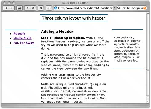
And here's how the completed layout looks (Figure 5.12): Figure 5.12. Voila! The finished result. Well, that was easy wasn't it? These are nice, simple, solid layouts that work well in a variety of browsers, old and new. Unfortunately, some other structural elements that are popular on many sites and that are easily achieved with table-based layouts, such as full-length columns and footers that automatically position themselves below the other content, are harder to achieve with CSS. That, however, won't stop us from doing these things. |