Modifying the MarkupNow you need to modify the template's markup to reflect the architecture of the home page. First change the div for the links in the left column so they look like this
<div id="nav">
  <ul>
    <li><a href="#">The Story</a></li>
    <li><a href="#">Illustrations</a></li>
    <li><a href="#">The Author</a></li>
    <li><a href="#">Related Links</a></li>
    <li><a href="#">Contact Us</a></li>
  </ul>
</div>
Next, modify the right column to look like this (edited for space here): <div id="rightcolumn"> <img src="/images/011/snergs_book_promo.jpg" /> <-- a <div id="newslinks"> <ul> <li>Snergs to be re-published by Cold Spring Press</li> <li>Douglas Anderson, Tolkien scholar, discusses the Snergs</li> <li class="morelink">more news</li> </ul> </div>
Now replace the placeholder content in the content div and add a footer div (highlighted in the code) after the content, but within the content div, like this <div id="content"> <h1>Before "The Hobbit," there was "The Marvellous Land of Snergs"...</h1> <img alt="Mother Meldrum in disguise, from the book 'The Marvelous Land of Snergs'"
You may be wondering why I added the footer right before the close of the contentarea div. The reason is that although absolute positioning is a quick and robust way to develop multicolumn layouts, it is almost impossible to get elements to clear absolutely positioned elements because absolutely positioned elements are removed from the flow of the layout. What this means here is that you can't put a footer under those side columns and have the footer move down as the columns get longer, as you did with the floating columns layout in Chapter 6.
If you try it, you will find that in cases where the side columns are longer than the content area (which can be made to push the footer because it's not absolutely positioned), the side columns extend over the footer. That's not a pretty sight. So I'll simply add my footer information at the end of the content column and know that if the side columns have a lot of content, they may extend down beyond the footer at the bottom of the content area. At least they won't cover it up!
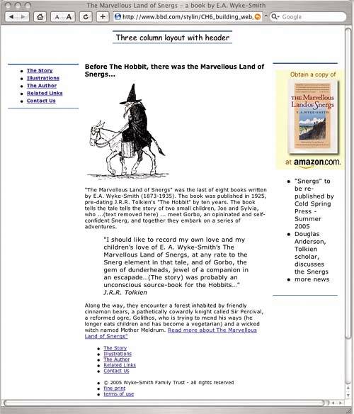
With all this markup in place, your page should now looks like Figure 8.5. Figure 8.5. Here is the markup as displayed by the unmodified template style sheet. Note that the style sheet does not yet have any styles for the footer or the right column. The text in this figure was edited and the text size reduced using the View menu in order to simplify capturing this image. Creating the HeaderYou should start refining the markup by adding a graphical header. The template's header area is currently styled with some centered text. You want a graphic in the header, but because the layout is fluid (that is, changes width as the browser window is resized by the user), you need to take an extra step to make the graphic appear to fill the entire width no matter what that is. Refer back to the box model diagram at the start of Chapter 4, which clearly shows that an element's background image overlays its background colorthat's the key to success here. The idea is to create a graphic that is centered in the header, and to have each end of that graphic fade into the background color that it overlays. Normally, if the browser is wider than the graphic, the background color is visible at each end. By fading the ends of the graphic into the background color, you can't see where one starts and the other begins. Figure8.6 shows the header graphic while it is under construction in Macromedia Fireworks. In this figure, I'm overlaying small rectangles at each end (note the blue dots that show one rectangle's selection). These small rectangles are filled with a side-to-side blend, which progresses from the header div's background color (the hexadecimal color #FFFFCC) to no color at all (transparent). When overlaid on the graphic, these little rectangles make the ends of the graphic fade to the background color. Figure 8.6. Making the sides of the image blend to the background color. Now, when you add this graphic into the header div <div id="header"> <img src="/images/011/snergs_header.gif" alt="The Marvellous Land of Snergs" width="776" and, in the style sheet, set the background of the div to the same color and height
div#header {height:60px; background-color:#FFC; text-align:center;} <-- a
the graphic simply seems to fade into an endlessly wide background as the user resizes the browser (see Figure8.7). Figure 8.7. The header graphic's "soft" edges makes it appear to .ll any width of browser. Now let's move on to the left navigation. Creating the Left NavigationFor the left navigation column, start with the file called list_unordered_12.htm from the Chapter 5 examples. Copy the styles from list_unordered_12.htm into the end of the style sheet, right after the div#footer style. Now your style sheet should look something like this
...(other styles)
div#rightcolumn p {font-size:.75em;}
div#listcontainer {border:1px solid #000; width:150px; font-size:.75em; margin:20px;}
You don't need the first rule div#listcontainer; the left column div with the class nav is already the container for your list, so you can delete that first rule. And of course, because your new containing div has a different name than the original, you need to change div#listcontainer to div#nav in each style's selector. Now you have this, with the modifications highlighted div#listcontainer {border:1px solid #000; width:150px; font-size:.75em; margin:20px;} div#nav ul {border:0; margin:12px 20px 12px 1.25em; padding:0; list-style-type:none;} div#nav li {border-bottom:2px dotted #069; margin:0; padding:.3em 0; text-indent:.5em} div#nav li:first-child {border-top:2px dotted #069;} div#nav a {text-decoration:none; color:#069;} div#nav a:hover {color: #F33 ;} * html div#nav ul {border-top:2px dotted #069;} <-- a
Now our left navigation looks like the list template from which you "stole" the styles (Figure 8.8). Figure 8.8. Now the links are styled again but need some positional adjustment in this context.
Let's do a few improvements to complete this navigation area. We no longer need the horizontal lines at the top and bottom of the left nav element now that we have the dotted line styles for the ul and li elements of the list, so remove them div#nav {position:absolute; left:0px; top:60px; width:150px; padding:.5em 0 0 0; margin:22px 0 0 15px; border-top:2px solid #069; border-bottom:1px Also we can change the color of the dotted lines to a more appropriate color
div#nav ul {border:0; margin:12px 20px 12px 1.25em; padding:0; list-style-type:none;}
div#nav li {border-bottom:2px dotted #960; margin:0; padding:.3em 0; text-indent:.5em}
div#nav li:first-child {border-top:2px dotted #960;}
div#nav a {text-decoration:none; color: #960;}
div#nav a:hover {color: #F33;}
* html div#nav ul {border-top:2px dotted #960;}        <-- a
Finally, let's change the color of the link and its rollover color
div#nav a {text-decoration:none; color: #C60;}
div#nav a:hover {color: #960;}
which results in Figure8.9. Figure 8.9. The left column is now styled.
Now let's develop the right column. Styling the Right ColumnThis column certainly needs some work. First off, the markup is not complete. The promo graphic should link to the book on Amazon.com. A quick search reveals that the book's URL is www.amazon.com/exec/obidos/ASIN/1882968042/qid=1110169295/sr=2-1/ref=pd_bbs_b_2_1/103-3869840-5485440. Let's add that to the promo image <div id="rightcolumn"> <a href="http://www.amazon.com/exec/obidos/ASIN/1882968042/qid=1110169295/sr=2-1 If you are working in Internet Explorer for Windows, you will see that adding the link that makes the image clickable has an unwanted side effect; there is now a blue border around the image (Figure 8.10). Figure 8.10. Internet Explorer for Windows adds a blue border around an image when you enclose the image tag in a link tag to make it clickable.
Presumably the developers at Microsoft think users need a visual cue that an image is clickable, but I think this graphic speaks for itself. Certainly, if I wanted a border for this graphic, it wouldn't be pure blue. Let's just get rid of it, like this
div#rightcolumn img {border:none;}
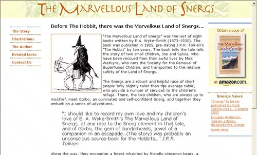
Now the blue border is gone. The bigger problem, also apparent in Figure 8.10, is that the right column isn't wide enough to accommodate the graphic. You can see how the content area text is overlapping it. The graphic is 156 pixels wide and 211 pixels high. It's good practice to add the dimension to any image in the markup because it helps the browser render the page faster. Because I did not do that in the original markup, I need to fix this oversight next. More importantly, we need to adjust some of the template's dimensions to accommodate this graphic. A quick check of the style sheet reveals that this column is only 125 pixels wide div#rightcolumn {position:absolute; width:125px; top:60px; right:0px; margin:20px 15px 0 That's also rather narrow for the news headlines that we want to add here; the line length will be very short, so, between this and the graphic issue, we need to make this column wider. The obvious first step is to set the right column's 125 pixels (highlighted in the code on the previous page) to 156 pixelsthe width of the graphic. Although this makes the column wider, text from the content area still overlaps it. The layout requires the center column to have left and right margins with areas wide or wider than the left and right columns, respectively, to prevent the content area from intruding into the columns. This is exactly the problem you see in Figure8.11. We need to increase the right margin on the center column as well as clean up some of the right column styles; for example, removing the margins from the right column will make it flush with the right edge of the browser, and removing its left/right padding will make the graphic fill the width of the column. The overall objective is to make the column accommodate that 156-pixel-wide graphic perfectly (instead of trimming the graphic to fit, always the other option), so, first, take care of the center column Figure 8.11. Widening the column gives the graphic more space, but the center column's right margin isn't wide enough and therefore it overlaps.
div#content {margin:20px 156px 0 165px; padding: 0 1em;}
div#rightcolumn {position:absolute; width:156px; top:60px; right:0px; margin:20px 15px 0 and then don't forget to add the image dimensions and a missing alt attribute to the markup <img src="/images/011/snergs_book_promo.jpg" width="156" height="211" alt="Buy 'The Marvellous Take a look with the border of the center column temporarily turned on to check exactly how the two columns relate (see Figures 8.12a and 8.12b). The top border of the right column is already visible (the code is not shown for the temporary thin black border on the content areayou know how to do that by now). Figure 8.12. FIGURES 8.12A AND 8.12B Internet Explorer for Windows is shown on the left and Safari is shown on the right. Both show very similar results in the relationship between the center and right column. Note that a thin black border is temporarily turned on in the center column to show how nicely it aligns with the right column.
OK, that looks good, so let's move on to styling the news links in the right column. Styling the News LinksThe first step in styling the news links is to remove the bullets from the list and make the type size smaller
div#rightcolumn div#newslinks ul {list-style-type:none; font-size:.7em;}
Unstyled lists achieve their layouts differently depending on the browsersome use padding and some use marginsso it's important to set both on a ul element to override the defaults div#rightcolumn div#newslinks ul {list-style-type:none; font-size:.7em; margin-left:0; This gets us to Figure 8.13. Figure 8.13. The list needs link tags to be added to make the list items clickable.
Now let's finish the markup on the links <ul> <li><a href="#">"Snergs" to be re-published by Cold Spring Press - Summer 2005</a></li> <li><a href="#">Douglas Anderson, Tolkien scholar, discusses the Snergs</a> </li> <li class="morelink"><a href="#">more news</a></li> </ul>
div#rightcolumn a {color: #C60; text-decoration:underline}
div#rightcolumn a:hover {color: #960; text-decoration: none;}
div#rightcolumn li.morelink {font-style:italic;}
Next, we need to add markup for a heading for these news items <div id="newslinks"> <h3>Snergs News</h3> <ul> <li><a href="#">"Snergs" to be re-published... and then style that heading and reduce the default top margin on the ul element below it to close the gap between the heading and the list div#rightcolumn div#newslinks ul {list-style-type:none; font-size:.7em; margin-left:0; Note that I added a dotted line above the heading by styling its border-top and added a few pixels of padding-top to create a bit of breathing space between the line and the heading (Figure 8.14). Figure 8.14. The news links look much better, but I don't like the way the right side of the links touch the edge of the browser.
Finally, notice that the way the right side of the news links touches the browser's edge isn't very appealing, so let's set the right margin on the ul element to fix that. Because you are now adding a third margin style, you should consolidate them into a single shorthand style div#rightcolumn div#newslinks ul {list-style-type:none; font-size:.7em; padding-left: Now it's time to turn off the temporary border on the center column that's been a useful reference during these last steps; then take a look at the finished right column (Figure 8.15). Figure 8.15. Here's the finished right column.
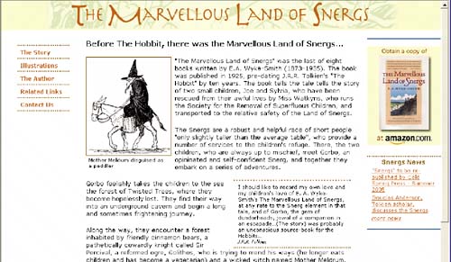
Creating the Content AreaNow let's move on to the content area. We'll deal with the headline last, once the rest of the page is done. Start by wrapping the text around the picture of Mother Meldrum, the old witch disguised as a peddler (Figure8.16). (I'll add back some text I removed earlier also.)
div#content img {float:left; border: 1px solid #096; margin:0 4px 4px 0;}
Figure 8.16. Floating the image causes the text to wrap around it. Because the image is primarily white on a white page, you can see that I added a border and small right and bottom margins to ensure that the text will not touch it. CREATING A CAPTION FOR THE MAIN IMAGENow add a caption for the picture of the witch. The easiest way to do this is to add the caption text in a paragraph directly after the image in the markup and wrap both the image and the paragraph in a div <div id="mainimage"> <img alt="Mother Meldrum in disguise, from the book 'The Marvellous Land of Snergs'" Next you need to float the div; the paragraph is a block level element, so it automatically appears under the picture. Let's change the styles by moving the float and the margins from the image on to your new div and styling the new paragraph
div#content div#mainimage {width:180px; float:left; margin:0 4px 4px 0;}
div#content div#mainimage img {float:left; border: 1px solid #960; margin:0 4px 4px 0;}
div#content div#mainimage p {font-size:.65em; margin:0px 5px;}
Next, style the blockquote. The blockquote tag is specifically designed for material that is quoted, so it's the right element to use for this Tolkien quote.
You don't need to put quote marks around text in a blockquote. No tag specifically for attributing the quote exists, and very few tags validate when you use them within a blockquote. That's why you need to put Tolkien's name in a p tag. You want the blockquote to float to the right and have the main body text wrap around it. (I added back the text I temporarily removed now, so you can clearly see this.) Figure 8.17 and the code here show the styling for the blockquote div#content blockquote {width: 250px; float:right; font-size:.7em; border-top: 3px dotted Figure 8.17. The blockquote floats to the right, with small margins to create space around it and a small amount of padding to hold the text away from the edge of the blockquote container. The most important steps are setting the blockquote's width and its float. Other new styles include dotted lines running across the top and bottom of the quote, a margin you can use to create some space on each side of the quote, and padding you can use to bring the text in from the edge, making the lines extended beyond the text on each side. Take the margin off the paragraph with the attribution to tuck it up under the quote. Then all that's left to do in the content area, besides adding the footer, is to style the link at the end of the text (and we'll also add the quote mark that is missing from the markup at the beginning of the book's title in that link!) (see Figure8.18).
div#content a {color:#C60; text-decoration:underline;}
div#content a:hover {color: #960; text-decoration:none;}
Figure 8.18. The link is now underlined in its regular "unrolled" state.
Figure 8.19. When the link is rolled, it changes color and the underlining is removed.
Styling the FooterWe can quickly lay out the footer with the footer styles we developed in Chapter 5. To do so, download the file called footer_template from the Components folder on the Stylin' site (www.bbd.com/stylin), open the file, and copy the following (heavily commented!) styles into the style sheet
div#footer {width:100%;        <-- a
padding:4px 0;        <-- b
font-size:.65em; font-size:.9em;        <-- c
text-align:center;        <-- d
background-color:#069;        <-- e
}
div#footer ul {margin:2px 0;}        <-- f
div#footer li {display:inline;        <-- g
color:white;        <-- h
border-left:1px solid;        <-- i
color:#AFF;        <-- j
padding:0 5px 0 9px;        <-- k
}
div#footer li:first-child {border-left:0;}        <-- l
div#footer ul li a {text-decoration:none;}       <-- m
div#footer ul li a:hover {text-decoration:underline;}        <-- n
div#footer ul.fineprint li {color:#CCC;}        <-- o
div#footer ul.fineprint li a {color:#CCC;}        <-- p
div#footer ul.fineprint li a:hover {color:#FFF;}        <-- q
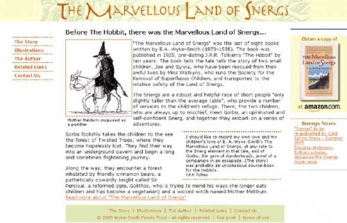
Figure 8.20. The footer needs some adjustment to the colors, but the layout is good for the first time. Note that because a specific link rollover color is not yet defined in the footer styles, it is inherited from the containing content div. With the modification of the one style noted (which was made because we have a reduced "master" font size inherited from the body tag, and further inheritance of 0.65 of an em makes the type unreadably small), the first preview is a pretty good start. Here's a great example of how taking the time to archive components can really speed up development. This footer probably took at least an hour to write and fine-tune the first time, but because we are reusing a suitable set of styles, and because the markup is always a basic list format, it now only takes a few minutes to create a suitable footer. We now need to work on the background and type colors. First, let's pick a background color that's more in keeping with the overall designthe green from the header graphic. We'll style the links and the little dividers between them with the same colors we used for the other links (Figure8.21). div#footer li {display:inline; color:white; border-left:1px solid; color:#C60; padding:0 Figure 8.21. Here is the styled footer with the new background and link colors. Figure8.22 shows where you are at this point. Figure 8.22. The big styling tasks are done. It's cleanup time. |