A Template With Negative MarginsI want to finish with one more template, which I call the "Wyke-Switch." For some time, I have been thinking about a simple way to create a three-column layout where the second column with content appears first in the markup. There is good reason for wanting to do this, since search engines rank content at the beginning of the markup as more relevant than content further down. Leading your markup with a long list of links and other non-content material that appears in the left sidebar can work against your search engine visibility. Also, there is an accessibility issue. If someone is reading your page with a screen reader, or using the keyboard to step through the markup, it's much more considerate to present the content first; otherwise the user has to make his or her way through the left column before getting to the page's content. While adding Skip Links options can help alleviate this problem (see Jim Hatcher's excellent article at www.jimthatcher.com/skipnav.htm for more on this), why not simply have the content appear first in the markup? So how do we write CSS for markup sequenced like this:
so it can appear in the browser like this?:
Here's the answer I came up with: use negative margins to exchange the position of the left and center columns. We have seen how margins with positive valuesvalues greater than zeroallow us to move one element away from another. Now we will explore how margins with negative valuesvalues less than zerocan be used to move an element into the space occupied by another. Let's look at a simple three-column example, using floats to get the columns to sit side by side. Here is the markup (it goes within the Strict template found at www.bbd.com/stylin) <div id="header">Content first in markup demo</div> <div id="contentarea"> <-- a <div id="column2">Column 2. This is the first column in the markup. The center column is
What is most notable about this markup is the order of the three columns: 2, 1, 3. Here is some CSS to layout this markup out as three columns
body {font: 0.8em verdana, arial, sans-serif;}
* {margin:0px; padding:0px;}
div#header {width:650px; background-color:#CAF;}
div#contentarea {width:650px; background-color:#CCC;}
div#column1 {float:left; width:150px; background-color:#FCC;}
div#column2 {float:left; width:350px; background-color:#CFC;}
div#column3 {float:left; width:150px; background-color:#AAF;}
div#footer {width:650px; background-color:#FAC;}
.clearthis {clear:both; height:0; linne-height:0;}        <-- a
which looks like this (Figure 6.11): Figure 6.11. This layout reflects the sequence of the markup where column 2 appears before column 1.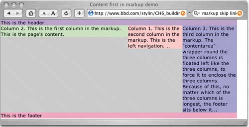 What we need to do now is switch the position of the first and second columns. Let's start by moving column 2, currently left-most, into its correct position by applying a left-margin with a positive value of 150 pixels to push it over far enough to make room for column 1, the 150 pixel wide navigation column
div#column2 {float:left; width:350px; margin-left:150px; background-color:#CFC;}
This moves the column over the correct amount in a standards-compliant browser, such as Safari (Figure 6.12). Figure 6.12. A left margin of 150 pixels pushes the content column into the correct position.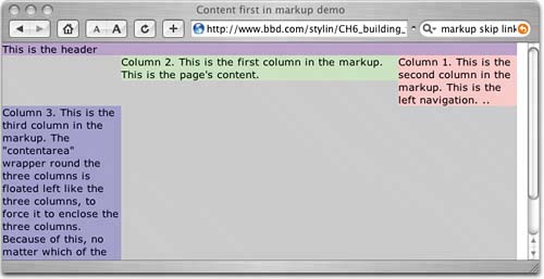 But, IDWIMIEInternet Explorer for Windows seems to have a small problem (Figure 6.13). Figure 6.13. Internet Explorer for Windows doubles the left-margin on a left-floated element. Don't ask why, just accept…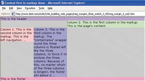 For some unknown reason, Internet Explorer for Windows doubles the left margin on a left floated element, and does the same for the right margin on right floated elements. This is a known bug.
A smart fellow called Steve Caslon, however, came up with the fix for this bug; change the element from a block-level element to an inline element, like this (Figure 6.14) div#column2 {float:left; width:350px; margin-left:150px; display:inline; background-color Figure 6.14. With the Caslon hack applied, Internet Explorer correctly displays the left-margin on the left- floated element.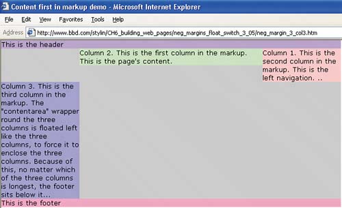 Much better. Internet Explorer for Windows now correctly positions this element. Column 3 is "wrapped" down to the line below, since we still have to make room for it by moving column 1 into the correct position.
Now we are going to move column 1 over into the space we created for it in the last step. We need to move it to the left by the width of column 2 (350 pixels) plus its own width (150 pixels)a total width of 500 pixels. We do this by setting a negative margin on the element, which moves it without disrupting the position of column 2 (Figure 6.15)
div#column1 {float:left; width:150px; margin-left:-500px; background-color:#FCC;}
Figure 6.15. The left negative margin moves the navigation column into its correct position and makes room for the right column to take its place.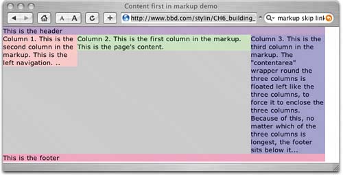 With column 1 in position, column 3 is able to move up to take the space vacated by column 1. So there is a simple way you can create a layout that does not follow the sequence of the markup. |